To the editor:
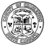
Your column about the need for a City of Charleston logo took me back to the early 2000s when Charleston County government wrestled with a similar issue. The county had a seal that was adopted in 1950 and used as the sole graphic representing the county. It was on buildings, cars, letterhead, etc. With four distinct quadrants, the seal was supposed to depict history, industry, culture and progress, but the images were obviously outdated and many were completely illegible. It became a blob when reduced down to a half-inch wide to fit on a business card, and you couldn’t even read the words “County of Charleston.”

Charleston County seal
But, some people still felt a sentimental attachment to the seal because of its historical connection to the county. They didn’t want to get rid of it.

Charleston County’s logo
The solution: Instead of replacing the seal, County Council decided to adopt a more modern logo that could be used, too. The seal still would have a place on more formal legal documents, like deeds and court records. The more modern and much simpler logo would be designed for everyday use. The county’s new logo was created to feature the neoclassic design of the central second and third floors of the historic courthouse’s Broad Street façade. It has a historic connection to Charleston County. It is timeless and won’t easily be out-of-date. It’s simple, and it is legible even if reduced to fit a business card.
When you discuss logos and seals, you’ve raised a subject that can get lots of people up in arms. Everyone has an opinion, and there is no single solution that will please the masses. The City of Charleston’s seal is cherished and serves as a touchstone for many residents. It has a significant role in the city’s history and isn’t something officials are likely to want to discard. If there is a desire to have something that stands out and is easier to read, the option of keeping the seal and supplementing it with a logo may provide a middle ground that is the most palatable for all sides.
— Name withheld upon request, Charleston, S.C.
To the editor:
While a replacement of the seal of the City of Charleston might be well-intentioned, perhaps using higher-resolution images of the seal and educating the public on the symbology of the seal is a better alternative. It contains many important messages that are timely today.

The City of Charleston’s “smudgy” seal
A review of proofs of the seal will show that it bears the image of Athena, her arms outstretched in welcome to all who would come to Charleston, a theme underscored by the ancient symbol of the palm fronds at the base of the seal, also a symbol of hospitality. The seal bears the image of an oil lamp (correctly identified by Mr. Brack), which is a symbol of enlightenment, apropos to Charleston’s current role as a leader in the new economy of the 21st Century. In the background of the center of the seal, we see Charleston Harbor from the vantage point of the water, a reference to the aspirations of those who make Charleston its home and its role as a busy port city (both as a major commercial hub and a “silicon harbor”).
The seal also bears two important democratic themes in Latin. Inscribed at the top we find “Aedes Mores Jurqque Curat”, translated loosely as “She guards her buildings, customs, and laws”, a heartening message who value governmental stability and continuity. Below the seal, we find the statement translated loosely: “Given to the government of her citizens in 1783.” What message could possibly be more empowering to the citizenry of our fair city? As with so many historic symbols, perhaps educating the public, rather than destroying ancient imagery, is a path to citizen empowerment and enlightenment.
— John E. Robinson, Charleston, S.C.
Editor’s note: Last week’s column actually called for a new logo, not a seal. Why not have a new logo, much like Charleston County created a few years ago, and keep the seal for official documents? One thing is for sure — the smudge we’ve currently got isn’t that attractive, especially for a world-class city.
Rant. Rave. Tell us what you really think. If you have an opinion on something we’ve offered or on a subject related to the Lowcountry, please send your letters of 150 words or less to: editor@charlestoncurrents.com. Our feedback policy.


 We Can Do Better, South Carolina!


