FEEDBACK: Thoughts from two readers on a new logo for Charleston
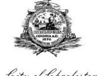
Letter: “Your column about the need for a City of Charleston logo took me back to the early 2000s when Charleston County government wrestled with a similar issue. The county had a seal that was adopted in 1950 and used as the sole graphic representing the county. It was on buildings, cars, letterhead, etc. With four distinct quadrants, the seal was supposed to depict history, industry, culture and progress, but the images were obviously outdated and many were completely illegible. It became a blob when reduced down to a half-inch wide to fit on a business card, and you couldn’t even read the words “County of Charleston.””


 We Can Do Better, South Carolina!


Recent Comments