BRACK: Charleston needs a better logo
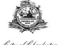
By Andy Brack, editor and publisher | Charleston, a world-class city in many respects, is missing one important thing: a logo that looks like more than a smudge.
You’ve seen it, a black and white monstrosity of an old-school design that has been reproduced so many times that it looks like a bad copy of something that you have no idea what the original was. There’s some palmetto fronds crossed at the bottom of some kind of building and the Carolopolis seal in front of it. There’s no telling what’s on top of the whole thing — a bird or a genie’s lamp or Lord knows what. Below the smudge is thin cursive script that reads, “City of Charleston.”
Is this really the best that a city that welcomes millions of visitors a year can do? A city that is busting at the seams with too many new hotels? A city where history intersects with charm? Folks, we can do better.











 We Can Do Better, South Carolina!











Recent Comments