By Andy Brack, editor and publisher | Charleston, a world-class city in many respects, is missing one important thing: a logo that looks like more than a smudge.
 You’ve seen it, a black and white monstrosity of an old-school design that has been reproduced so many times that it looks like a bad copy of something that you have no idea what the original was. There’s some palmetto fronds crossed at the bottom of some kind of building and the Carolopolis seal in front of it. There’s no telling what’s on top of the whole thing — a bird or a genie’s lamp or Lord knows what. Below the smudge is thin cursive script that reads, “City of Charleston.”
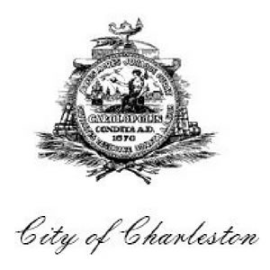 Is this really the best that a city that welcomes millions of visitors a year can do? A city that is busting at the seams with too many new hotels? A city where history intersects with charm? Folks, we can do better.
A logo is a graphic mark or symbol that reflects the deeper meaning of a company or a brand. It’s hard, for example, to think of Coca Cola without the distinctive cursive letters of its logo. Can you imagine Apple Computers without seeing the apple icon missing a bite or McDonald’s without its golden arches?
Effective logos are tough to perfect. Good ones incorporate the values of an organization and represent them visually. Just look at some examples from other world-class cities:
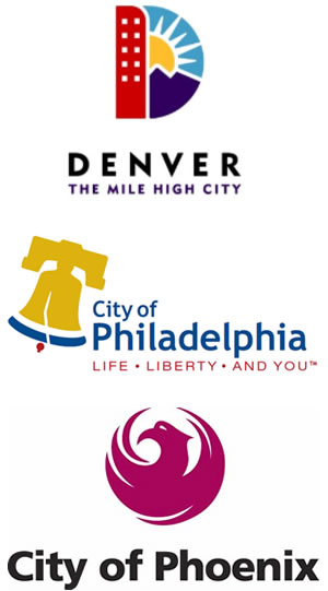 Denver’s brand includes the words “The Mile High City” along with a big D comprised of a tall building, sunshine and mountains. Although some critics have complained about Philadelphia’s logo, it incorporates something everyone thinks of about the city — the Liberty Bell — into its branding and adds the slogan, “Life, liberty and you.” Phoenix offers a round icon of a phoenix that conjures a link to its native American past.
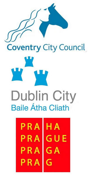
Cities across the world have been bolder with how they’re represented with logos, often shrugging off the heralds or coats of arms that they’ve worn for years. The city of Coventry, England, offers a modern look that blends a crisp take on what it’s known for — Lady Godiva riding a horse naked through the city. Dublin offers a memorable icon with its three castles and Gaelic lettering. Prague’s red square with four ways of spelling its name graphically illustrates its heritage and international flavor.
 “Many cities in the U.S. and around the world have unique logos,” according to GraphicSprings.com. “Wondering why a city would need a logo? It’s a good idea to ‘brand’ a city for several reasons. A strong brand presence can solidify a distinct personality, promote tourism and business, and bolster a positive perception of the city by inhabitants and the rest of the world.”
The smudge that Charleston has certainly reflects history, but it doesn’t have anything to do with the warmth shown to visitors, the dynamism in the Silicon Harbor or the beauty of the Lowcountry landscape.
It’s time for the city of Charleston to come up with something much, much better. I suggest a three-way path for a new logo:
- New Mayor John Tecklenburg and the city council need to have neighborhood meetings — call them “charrettes” if it will make bureaucrats feel better — to explore the symbols and values that residents have. The information can be used to get a sense of what residents think the city represents and where it is headed.
- The city should sponsor a logo design contest for students of all ages to get input on how they would draw a logo for Charleston. Something from this exercise could provide a winning design or a pathway for one.
- Hire a graphic design team to take all of the information gathered in the first two exercises and develop a logo and branding package for Charleston.
The city has grown up in so many ways in recent years so that it’s now the top destination city in the world. Shouldn’t it also have the best logo in the world?
- Have a comment? Send to editor@charlestoncurrents.com


 We Can Do Better, South Carolina!











One Comment